The Melo Vault
From Early MVP to Investor-Ready Product Vision
Overview
Melo Vault is an early-stage student discovery platform designed to help admissions teams, recruiters, and educational organizations identify and evaluate prospective students more effectively.
The founder had an MVP, but the product lacked the structure, clarity, and credibility needed to communicate its value to investors and future users. I redesigned the experience into a clearer, more scalable product vision with improved UX architecture, high-fidelity UI, and a clickable prototype.
Methodology: I utilized AI to accelerate secondary research and complex ideation. My approach emphasizes cautious AI integration; using technology to handle the heavy lifting while I provided the strategic oversight and verification necessary for a professional result.
The Result: A high-tier design system and a strategic blueprint that allows Melo Vault to scale independently, minus the enterprise price tag.
Methods & Activities
-
UX audit of the existing MVP
-
Heuristic review of key screens
-
Competitive benchmarking
-
AI-assisted secondary research
-
User-role and workflow mapping
-
Information architecture redesign
-
High-fidelity UI design
-
Design system creation
-
Clickable prototype development
My Role
Solo Product Designer / UX Strategist
-
I led the product evaluation, UX audit, IA redesign, UI redesign, design system creation, and high-fidelity prototype development.
Tools
Figma, Figma Make, Perplexity, Claude
Project Success Highlights
Transformed an Early MVP into an Investor-Ready Product
Redesigned an early-stage concept into a polished, high-fidelity product vision that helped the founder communicate the platform's value to investors and future stakeholders.
Reimagined the Product Architecture
Redesigned the information architecture, navigation, and user flows to support three distinct user groups, students, recruiters, and admissions teams, creating a scalable product foundation.
Established a Scalable Design System
Developed reusable UI components, design tokens, and interaction patterns that improved consistency and accelerated future product development.
Created a Clickable High-Fidelity Prototype
Designed and prototyped the complete product experience in Figma, enabling realistic demonstrations for fundraising, stakeholder alignment, and early product validation.

Over 1.5 million students apply to college in the U.S. every year, investing hundreds of hours navigating a complex application process while admissions teams evaluate millions of applications under tight deadlines.
Challenge
Refining the Project Scope
The original MVP communicated the basic concept but did not yet feel like a credible, investor-ready product. The experience had unclear navigation, weak information hierarchy, limited discoverability, and inconsistent UI patterns.
The biggest design challenge was turning a functional but early product into a polished product vision that could support fundraising conversations, explain the business opportunity, and guide future engineering work.
This matches the PDF’s Melo Vault framing: the project moved from an early MVP to an investor-ready vision, including UX audit, redesigned IA, refined profile/evaluation screens, design system, and clickable Figma prototype.
UI/UX Audit

-
The site is intended for the Gen Z audience, but its design feels outdated.
-
There is no option available for signing in with a Google account.
-
The sign-in page lacks any information that communicates the website’s purpose, which currently makes it appear untrustworthy or potentially fraudulent.

-
Redundant information on the landing page creates clutter and makes it more difficult to locate new or relevant content.
-
The search functionality was restricted to locating students by name only.
-
The feed appears unnecessary and irrelevant to administrators. I recommend collecting user feedback during testing to determine whether it provides real value or should be reconsidered.

-
The current interface lacks filtering capabilities to refine search results.
-
There’s currently no functionality that allows users to compare students.
-
During user interviews, we need to identify which information is most relevant and should be displayed in this section.

-
Information should be presented efficiently and in an easily digestible format.
-
The hierarchy of information should be verified by the user.

Leveraged AI tools, including Claude and Perplexity, to accelerate research, competitive analysis, content synthesis, and design exploration, reducing the end-to-end product design process to just 3
Solutioning
Product Strategy
I reframed the product around three core user groups.
Students:
Need to present their achievements, interests, academic profile, and potential in a structured way.
Recruiters:
Need to discover qualified candidates quickly through filters, search, and profile scanning.
Admins / Admissions Teams
Need a dashboard to evaluate, compare, and manage student information efficiently.
Design Principles
1. Make student talent discoverable
The redesigned search and filtering system helps recruiters and admissions teams identify students based on relevant academic, personal, and extracurricular signals.
2. Reduce cognitive load
The new profile layout organizes student information into clearer sections, making evaluation faster and more intuitive.
3. Build trust through visual polish
The UI was redesigned to feel more credible, structured, and investor-ready.
4. Create a scalable product foundation
The design system and reusable components created a foundation for future development.
High Fidelity Prototype
Landing Page

.png)

-
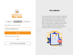
Three separate tailored sign-in experiences for each stakeholder: students, admins, and recruiters.
-
Each entry point features a role-specific value proposition, educating users on what to expect and the value the platform delivers.
Sign up Process


-
Clear, step-by-step account setup paths for each stakeholder group.
Admin Home

-
Used AI research workflows to map out the standard evaluation criteria and qualifications for admin review.
-
Designed a high-visibility dashboard that centralizes critical tracking metrics and pipeline data, transforming complex administrative planning into a seamless, intuitive process.
-
Integrated email communications into the dashboard to create a centralized, single-pane-of-glass view for all critical information.
Search Page

-
Designed and launched the platform's first dedicated search and research page, addressing a critical feature gap from the initial MVP.
-
Leverage AI to determine the search categories and variables that impact the admin decisions about filtering or offering candidates.
-
Designed an interactive criteria simulator that allows administrators to slide GPA, ACT, and SAT variables in real time, instantly updating the candidate pool volume to show how shifting standards impact recruitment yields.
Student Profile

-
Leveraged AI to identify and define the critical data points and documentation students must submit during the college admissions application process.
-
Engineered a user-centric information hierarchy prioritized by core administrative decision drivers, transitioning seamlessly from macro timeline metrics to deep-dive applicant data.
-
Translated secondary research and AI insights into a visual dashboard feature, enabling administrators to seamlessly compare individual student performance against school and national averages.
-
Unified critical administrative actions directly into the primary dashboard view, enabling users to seamlessly make final placement decisions, request missing documentation, save print-ready files, and generate live-share links without leaving the page.
System Designs
